Log a visitor count and queue time per zone per time slot, and see it played back on an
animated WebGL park map - zones colour-coded by crowd density, with fading particle
trails flowing along the paths between zones, a day heatmap, spotlight zones on click,
and a cinematic camera-pan replay of the whole day.
Zones and the paths between them rendered with the browser's native WebGL API - not a
static image or a canvas-2D approximation - so the map genuinely animates as you step
through the day.
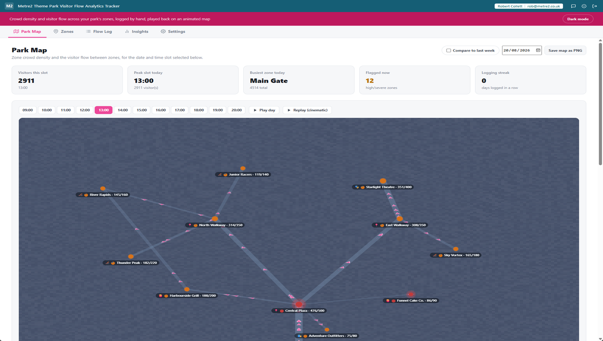
Animated particle flow between zones
Small particles move along each path at a speed and density that reflects how much
visitor flow the app estimates is moving between those two zones right now.
Flow, derived - not double-logged
Path-level flow is estimated purely from the visitor counts already logged at each
end, using a gravity-style heuristic: flow along a path is bounded by however busy its
quieter end is. There's no separate path-by-path form to keep up with.
Density colour-coding, Low to Severe
Each zone's logged visitor count against its capacity buckets into Low, Moderate, High
or Severe, colour-coded on the map and echoed in a ranked congestion alert list so the
zones that need attention are obvious at a glance.
A time-slot scrubber, with playback
Step through the day's time slots one at a time, press play to watch density and flow
shift across the whole park automatically, or press Replay for a cinematic version that
pans the camera too.
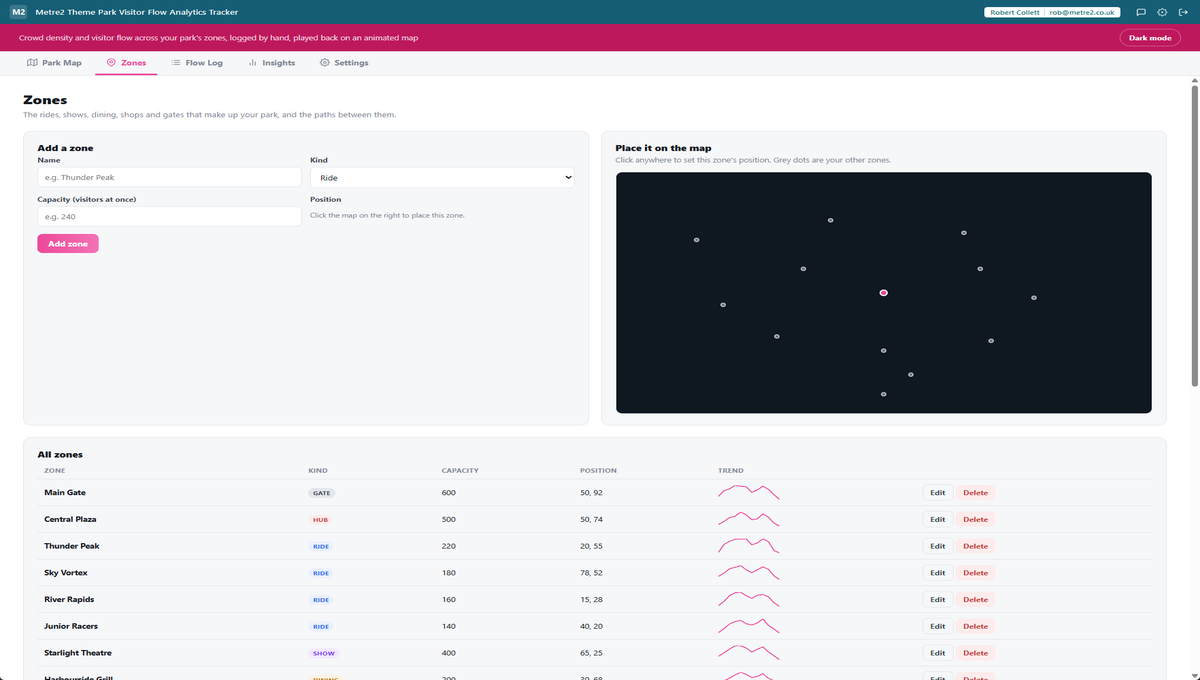
A click-to-place zone editor
Add zones - gates, rides, shows, dining, shops, hubs, each with its own icon glyph -
with a name, kind and capacity, positioned by clicking directly on a mini map, then
connect them with paths that feed the flow visualisation.
Fading trails, a Severe glow, and desire lines
Flow particles trail off as they move, any zone at Severe density pulses with a soft
glow, and paths render thicker the more visitor flow they've carried across the whole
day - so the map's busiest routes are visible at a glance, not just its busiest zones.
A day-lighting background, and click-to-spotlight
The map's background tints from cool dawn through a genuinely bright midday to warm
dusk as you move the time-slot scrubber, and clicking any zone spotlights it - dimming
every zone, path and particle that isn't directly connected to it.
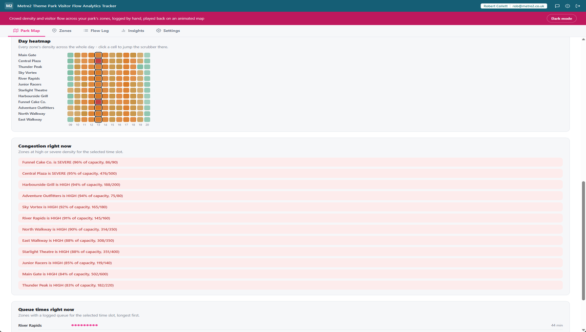
A day heatmap and a compare-to-last-week overlay
A GitHub-contributions-style heatmap plots every zone against every time slot - click a
cell to jump the scrubber straight there - and a compare-to-last-week toggle overlays
faint markers from the same slot exactly seven days earlier, so an unusual spike or
drop stands out immediately.
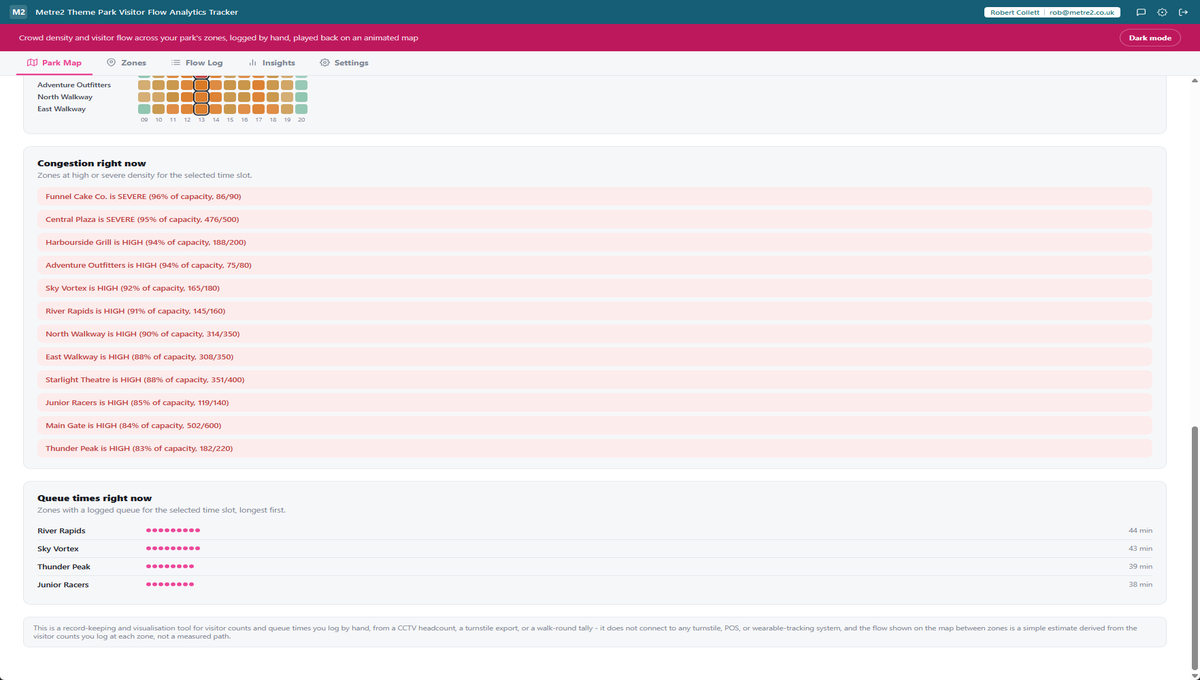
Per-zone sparklines and a queue-length panel
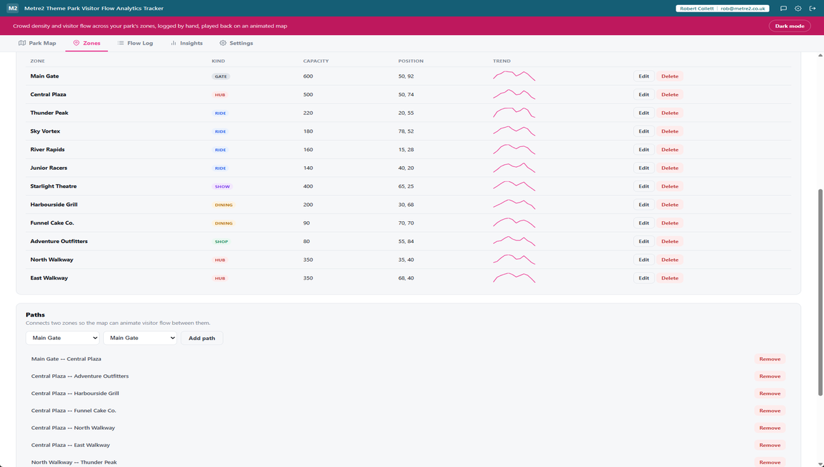
The Zones table gains a small inline trend line for each zone's visitor curve across
the day, and a new panel ranks every zone with a logged queue by length, with one dot
per roughly five minutes of wait.
Cinematic "replay the day" mode
Press Replay instead of Play and the map auto-scrubs from the first time slot to the
last while the WebGL camera pans and zooms toward whichever zone is busiest at each
moment, stopping itself automatically once the day is done.
A confetti burst when the park goes quiet
When every tracked zone drops to Low density in the same time slot, a short confetti
celebration fires - and every stat card counts up from zero on each refresh instead of
just appearing.
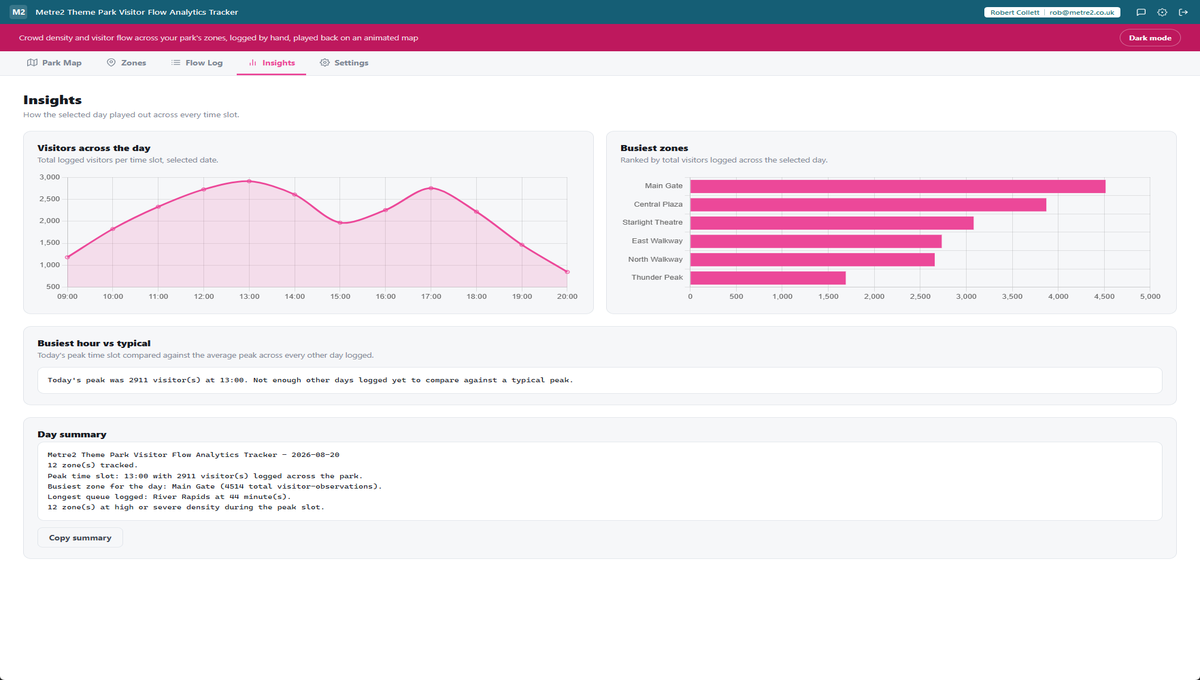
Insights: busiest zones and hourly totals
A busiest-zones ranking and a park-wide hourly visitor chart, plus a plain-text daily
summary you can copy straight into a report or a message to your team.
Deliberately not a live feed
This is a record-keeping and visualisation tool - it does not connect to any turnstile,
point-of-sale, or wearable-tracking system. Every number on the map comes from what you
log by hand, so there's nothing to configure and no credentials to hand over.
Keyboard shortcuts, a now-marker, and a PNG export
Left/Right arrows step the time slot, space toggles play, and escape clears a
spotlight. When you're viewing today, a small marker on the scrubber shows the slot
closest to the current time, and a Save map as PNG button captures the WebGL map as an
image.
A capacity ring, chevrons, and a busiest-hour comparison
Every zone label now carries a small ring showing crowd fill at a glance, and
directional chevrons ride the flow particles so movement direction reads instantly.
Insights compares today's peak time slot against the average peak across every other
day you've logged, and a logging-streak stat on the Park Map counts consecutive days
with at least one entry - all derived from data you're already logging.
Sample data, one click away
Load a realistic 12-zone sample park with a full day of time-slot logs so you can see
how the map, density colours and flow animation behave before logging your own zones.
Light/dark theme
Light/dark theme remembers your choice, matching the rest of the Metre2 portfolio.
Theme Park Visitor Flow Analytics Tracker, in practice
The Park Map tab, the Zones editor, Flow Log, and the Insights charts.
Park Map: summary cards, the animated WebGL map with capacity rings and chevrons
Day heatmap across every zone and time slot, plus a ranked congestion alert list
Congestion alerts and a queue-length panel ranking zones by wait time
Zones: a click-to-place editor with name, kind and capacity on a mini map
Every zone with a sparkline trend line, and the paths that connect them
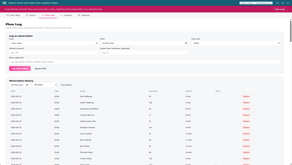
Flow Log: log a visitor count and queue time, with a filterable history table
Insights: visitors by time slot, busiest zones, busiest-hour-vs-typical, and a copyable summary
Frequently asked questions
Does Theme Park Visitor Flow Analytics Tracker connect to turnstiles, POS or wearables?
No. It is deliberately a record-keeping and visualisation tool - it does not connect to any turnstile, point-of-sale, or wearable-tracking system. You log a visitor count and queue time per zone per time slot by hand, and the app builds the map, density colours and flow animation from what you log.
How does the animated flow on the park map work if I only log per-zone visitor counts?
Each path's flow is estimated from the visitor counts already logged at both of its endpoint zones, using a simple gravity-style heuristic: a path can't carry more people than its emptier end can currently hold, so its flow is bounded by whichever zone is quieter. There's no separate path-level logging to keep up with - it's derived automatically from the same per-zone numbers you're already entering.
How is crowd density calculated?
Each zone has a capacity you set once. Density is the logged visitor count for a time slot divided by that capacity, bucketed into Low, Moderate, High or Severe - colour-coded on the map and in the congestion alert list, so the zones that need attention are obvious at a glance.
What does the park map actually look like?
A real WebGL-rendered map, not a static image or a canvas-2D approximation - zones as colour-coded nodes, paths between them as lines, and animated particles moving along those paths to show the estimated flow direction and volume for the time slot you've selected.
Can I play back a full day, not just one time slot?
Yes. A time-slot scrubber steps through the day's slots one at a time, or press play to step through them automatically and watch density and flow shift across the park as the day goes on. Press Replay instead of Play for a cinematic version that also pans and zooms the WebGL camera toward whichever zone is busiest at each moment.
Can I compare today to how the park looked last week?
Yes - a compare-to-last-week toggle on the Park Map tab overlays faint markers showing each zone's crowd level at the same time slot exactly seven days earlier, so an unusual spike or drop is visible at a glance. There's also a day heatmap across every zone and time slot, and per-zone sparkline trend lines in the Zones table, for the same kind of at-a-glance comparison.
Can I save a snapshot of the park map, and are there keyboard shortcuts?
Yes to both. A Save map as PNG button captures the WebGL map at its current frame and downloads it as an image, and the Park Map tab supports keyboard shortcuts - the Left/Right arrows step the time slot, Space toggles play, and Escape clears an active spotlight. When you're viewing today's date, a small "you are here" marker also shows which slot is closest to the current time.
How do I know if today is busier than usual, and does the app track my logging habit?
Insights compares today's peak time slot against the average peak visitor count across every other day you've logged, so you can see at a glance whether today is running above, below, or in line with typical. Separately, a logging-streak stat on the Park Map counts how many consecutive days (including today) have at least one entry logged, as a gentle nudge to keep the data current.
Does my Theme Park Visitor Flow Analytics Tracker account work with Vector and Forma?
Yes - Theme Park Visitor Flow Analytics Tracker uses the same shared Metre2 account as Vector, Forma and every other Keystone app. Sign in once and it works everywhere.
Ready to try Theme Park Visitor Flow Analytics Tracker?